My Title Design
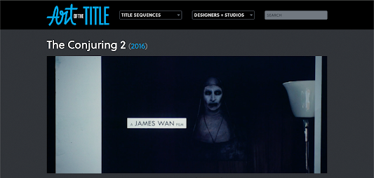
Font: coney: innocent turned for the worst
Rubik Doodle Shadow -![]()
Rubik Burned -![]()
Contrast: Color – Depending on the background, between black and white. If needed, fill in the words with black or white to make it readable.
Size: depending on the shot and what is going on in each scene.
Purpose – To show who was in charge of what and who was in the film. the title is most of the time less important for the people watching.
Working title: Rabbit Hole Sweets
How will the titles (the words) enter and leave the screen? By fading or dissolving in/away, sometimes staying in a shot.
How long will each title be on the screen before it disappears? Depending on the length of the title, make sure the viewer can read it.


Comments
Post a Comment